
Pyvott App
What if we threw in the kitchen sink?
Client:
Pyvott
Agency:
Grio
Role:
Creative direction, strategy, UI design
In the fall of 2020, Pyvott engaged with Grio in a remote, user story workshop with the intention of developing a new social media app. The workshop was broken up in to 2-hour sessions across 3 days.
The result of the workshop was a series of user stories which were used as the basis for initial conceptual designs as well as detailed designs. The app launched in the Apple App Store and Google Play Store in the spring of 2021.
The Usual Suspects
My first step on the project was to look at some social media apps, including: Pinterest, Instagram, YouTube, TikTok, Twitter, and SnapChat.
I was already familiar all these platforms in varying degrees, but when I lined them up together, patterns emerged:
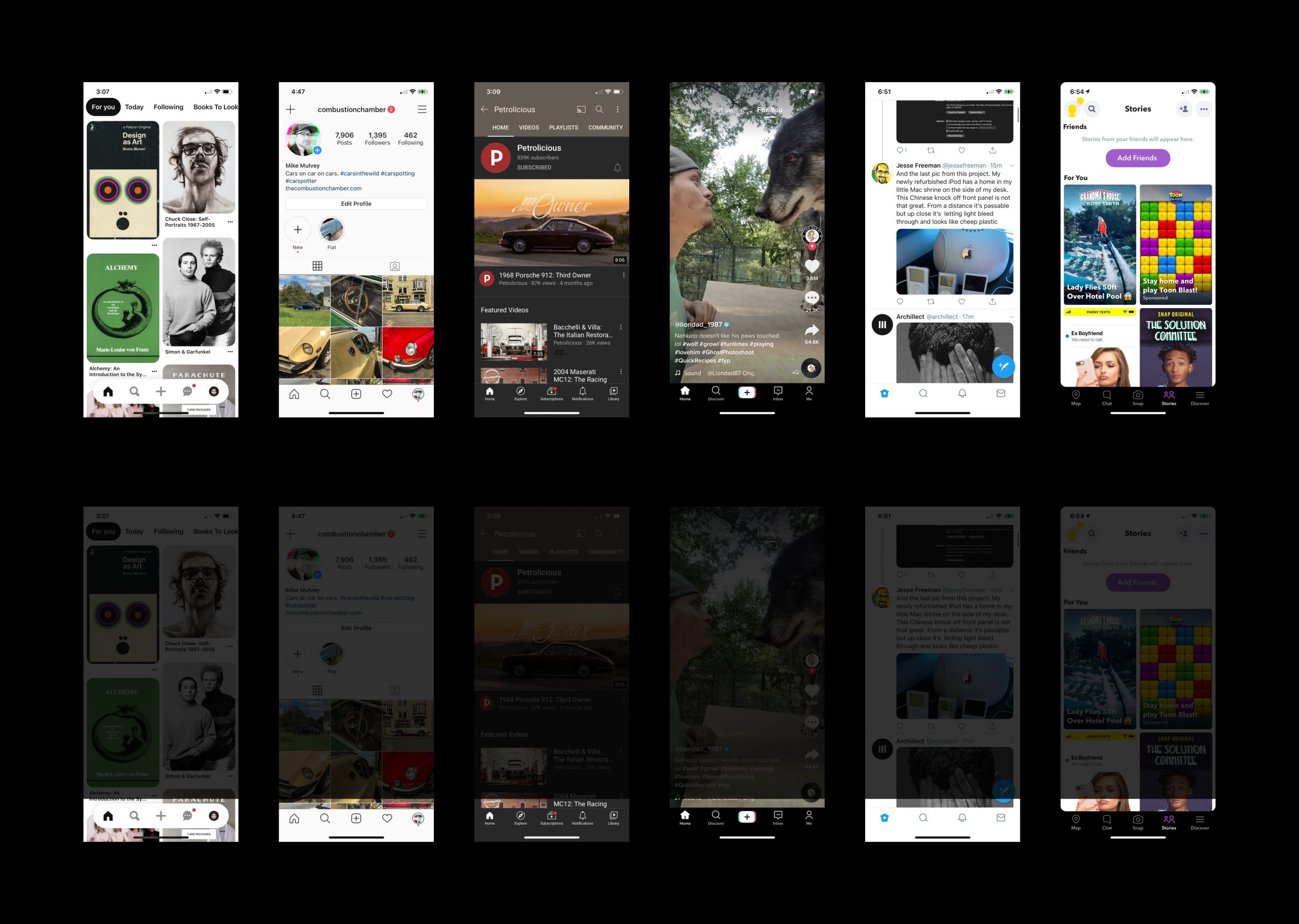
Looking at these apps with fresh eyes I had realized how social media had matured and how much sameness existed. Things had stagnated.
Apparently there was only one design pattern for social media and that was a bottom tab bar with icons for Home, Search, Upload, Notifications, and Profile.
Wow. How innovative.
Sure, design patterns are important, and you shouldn't just change things for the sake of change, but you should also make sure you're not getting lazy in your design process.
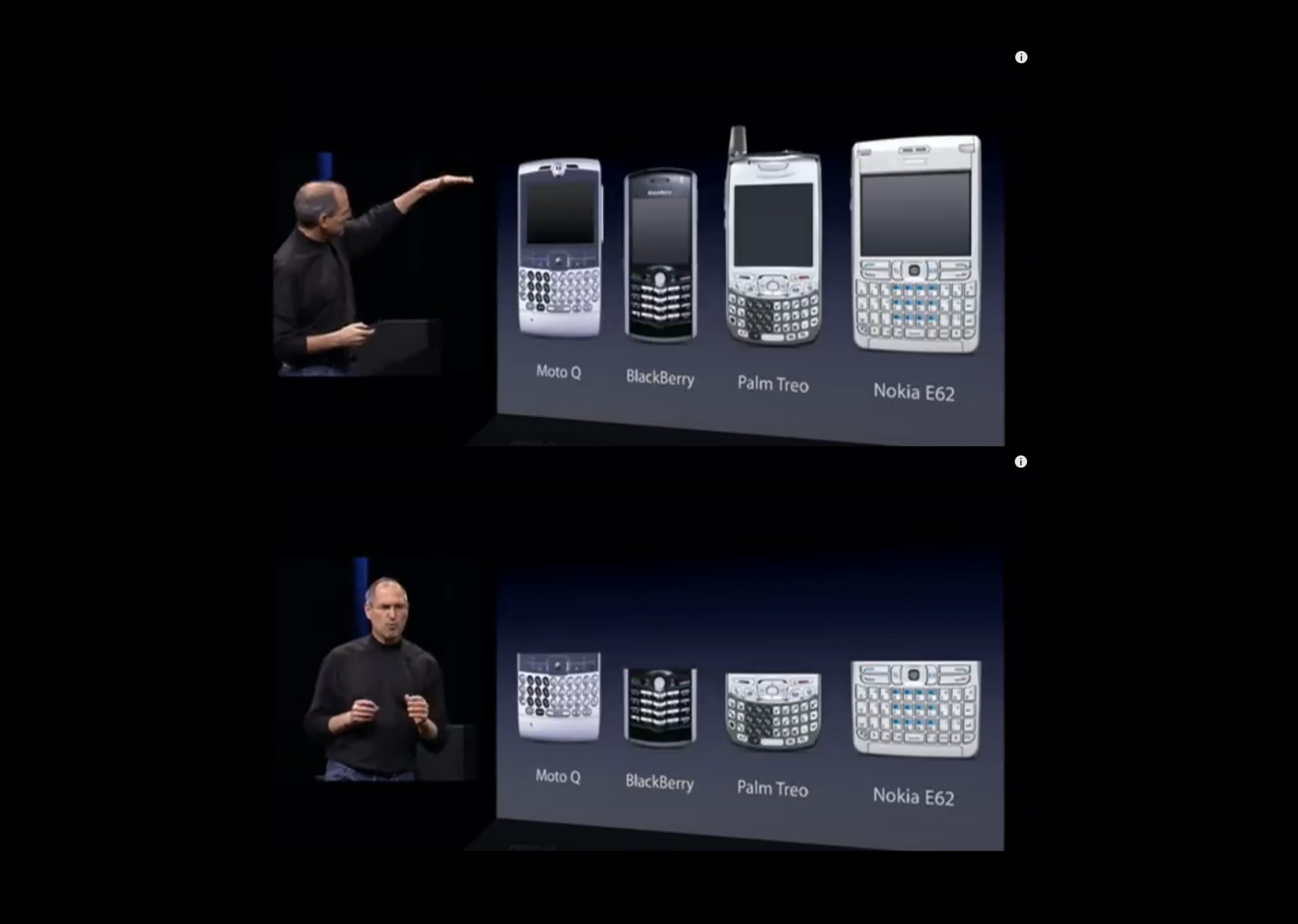
Sidenote: I stole my presentation format from Steve Jobs' original iPhone keynote (If you've never seen this keynote, do youself a favor and watch it). In the keynote, Jobs explains that the inherent problem with the then-current lineup of supposed "smartphones" were the keyboards. "They all have these keyboards that are there whether you need them or not to be there."
So much like the original iPhone getting rid of the hardware keyboard, we got rid of the bottom tab bar.
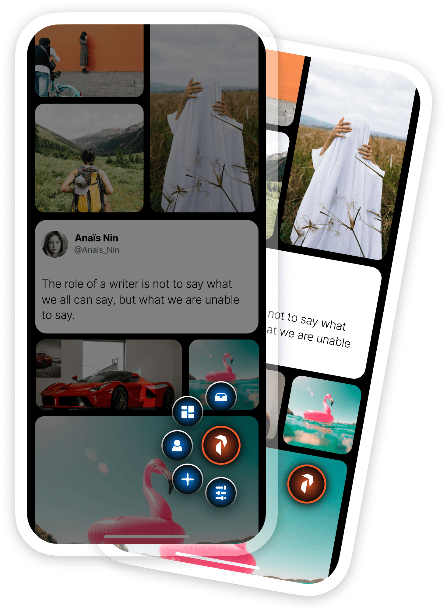
During the workshop the client emphasized calls was how they wanted a mobile experience to use the entire phone screen.
Our screens were no longer rectangles. They extended to all four, rounded corners of the device. The phone was the screen, and the screen was the phone. He wanted the Pyvott app to saturate the whole thing.
So we got rid of the bottom tab bar every single other social media app had and we rolled it up into the "Pyvott Button".
When you tapped on the Pyvott Button, it would expand to reveal all the key actions you could take. From top to bottom they were: Messages, Feeds, Profile, Upload, Customize Feed.
It's the question that drives us
Why do we only have one feed? This was the question that drove my subsequent design decisions. Let me get this straight, I'm able to have multiple home screens on my iPhone, but Instagram only has one feed for all the accounts I follow?
How does that make any sense? It seems unnecessarily resticting on such a powerful little pocket computer capable of doing so many things.

At the time of this phase of the project (fall 2020), the first home screen on my iPhone (running iOS 14) included the apps I use on a daily basis. The second screen was media apps (video, music, books). The third screen had various utilities. I still mostly use this organizational structure on my iPhone today.
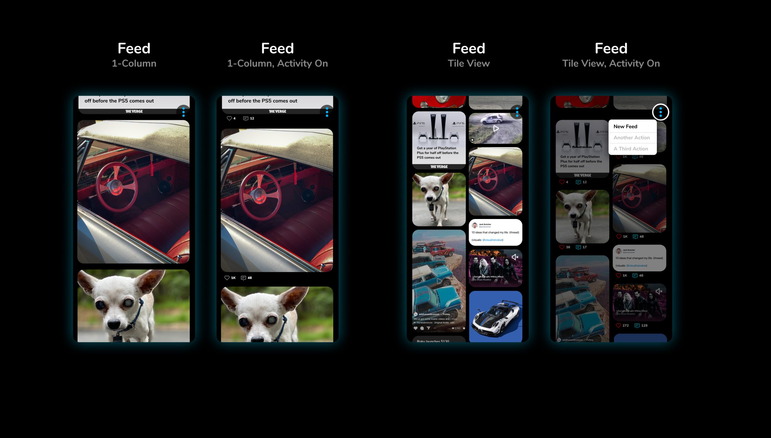
When you're the lead on a project, you can drop your adorable 15-year-old chihuahua into the comps.
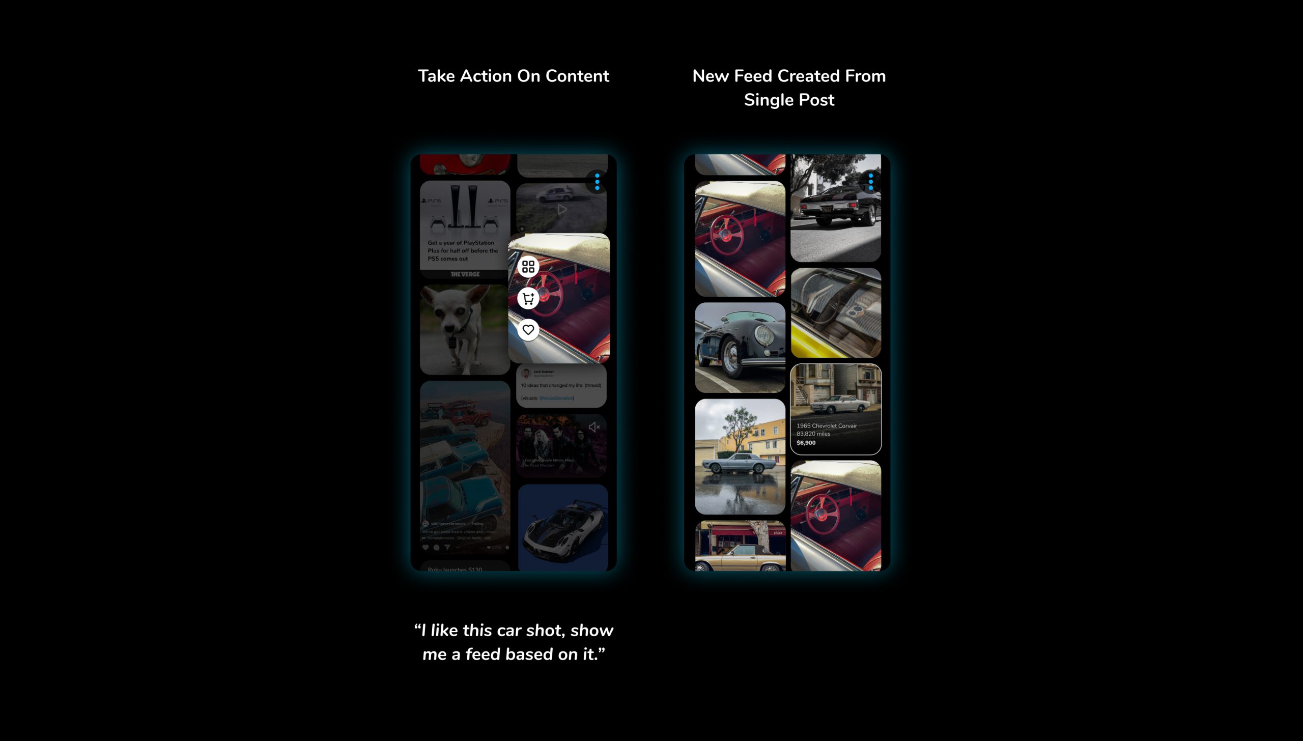
If you don't have a classic cars feed, you need to examine what your priorities in life are.
I started sketching and mocking up ideas, not only for multiple feeds, but for multiple layouts. Again, we need to question conventions. Do posts always have to be single file, one on top of the other? Could we mix up the grid and intersperse different sized posts as well as different content types?
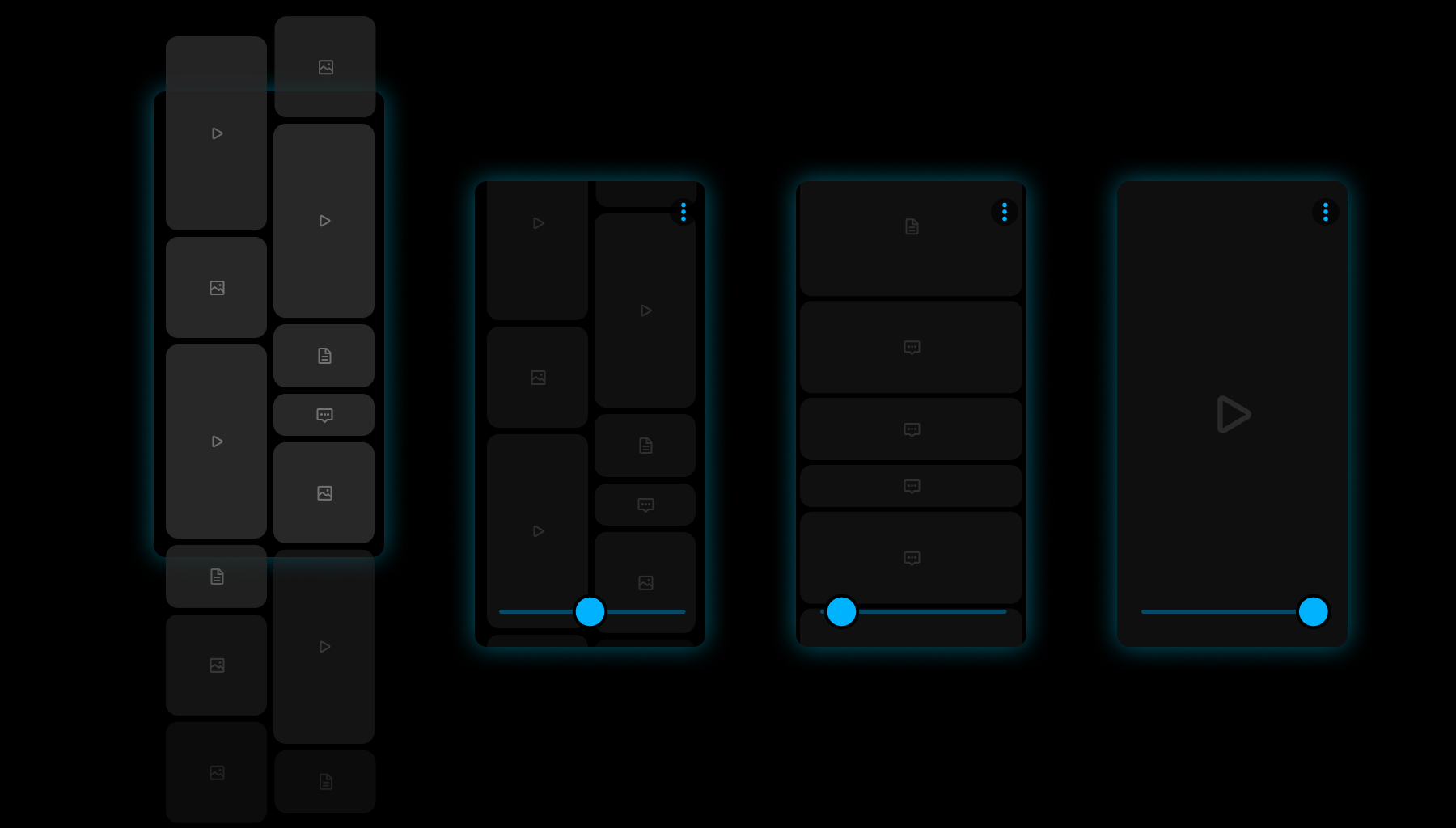
My intial idea was having a slider that would change the density of posts in real-time in a smooth, liquidy transition and finger slid across it.

Look at that. Multiple feeds organized by me. Much more civilized.

Reorder your feeds simply by tapping on the feed header, then tap-and-hold on any feed title to sort it.
Once you have a bunch of feeds, you need to be able to navigate between them. It's simple. You can swipe left and right, or you can jump right to a specific feed from header.
Having Fun with Prototypes
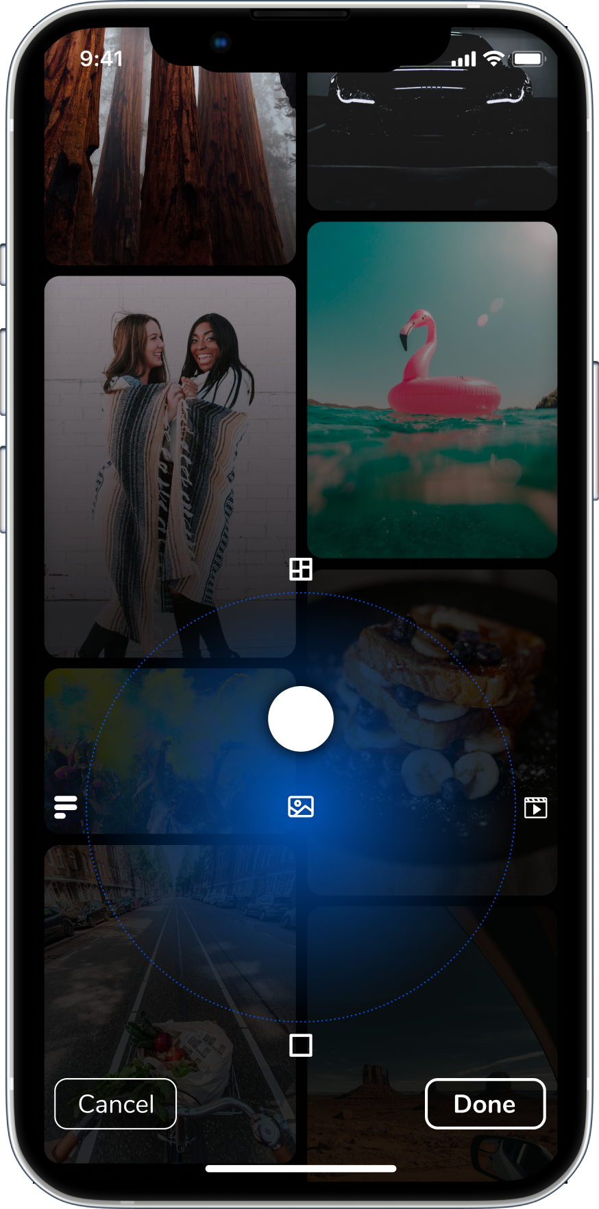
You always want to aim high when you're designing. This concept was asking for a lot. The idea was you slide your finger across X- and Y-axis to control both the grid density as well as content types displayed.
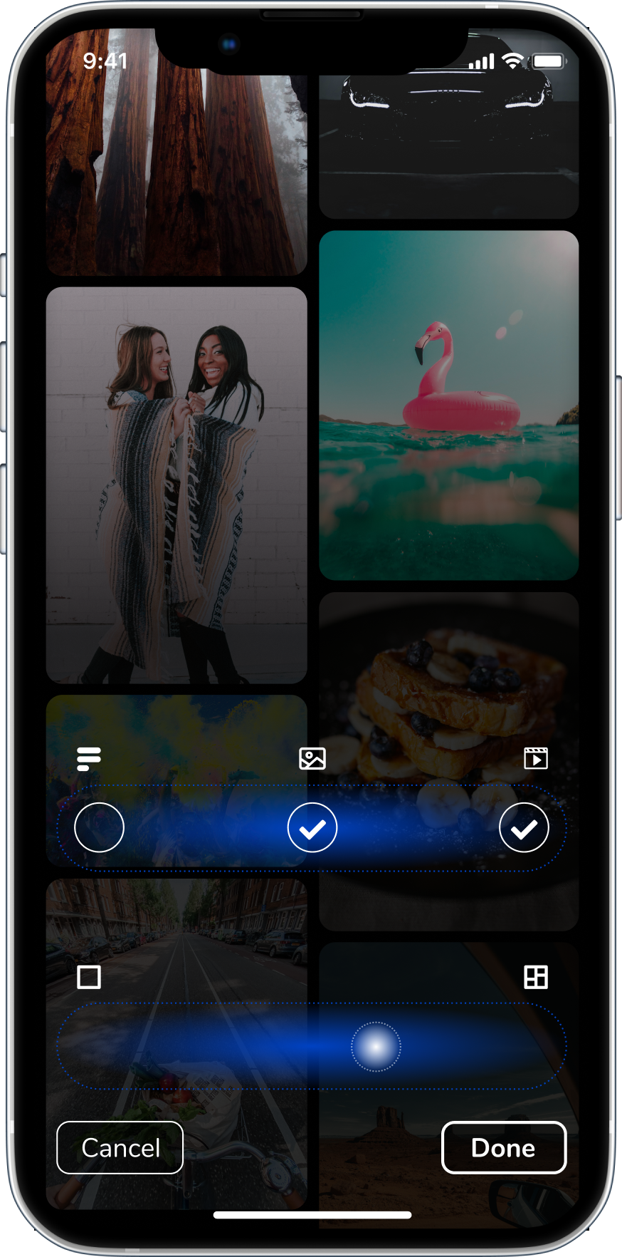
When I realized the X/Y controller wasn't practical, I decoupled content type control from content density control. Not as sexy, but way more usable.
This was a fun prototype I put together in Principle to better demonstrate what was bouncing around in my head.
At one point the client texted me for this video when he was with potential investors.
Influencers
The client expressed their desire to court high profile, high traffic people: celebrities, actors, musicians, influencers, and everyone in between. They wanted it to be obvious when you viewed a profile page what someone's status was. The Rock was mentioned numerous times our user story workshops an video calls, so we built designs around him.
We took it a step further and imagined a scenario where the app could serve up customized versions of an influencer's profile based on your user data (age, gender, location, interests, device use, purchasing behavior).

From left to right: 1. Influencer Profile page; 2, 3, & 4: Different layouts of the same Profile page, depending on your profile data
Behind the scenes
With multiple designers building out multiple user flows in Figma, it quickly became evident we needed to keep things organized or risk being eaten alive by Figma.
We needed a system to let anyone jumping into Figma immediately know whether a design or user flow was In Progress, Approved, Rejected, or was a Future Design.
So that's what I created.
Oh, one more thing. Whenever possible, we included the Jira ticket number in the status label. That was super helpful.

Organized chaos in Figma. It's better than the alternative.